
The more I learn about coding the more I’m able to identify my mistakes and shortcomings. I coded a ‘Hotel’ page for my South Ataria Island website a couple of weeks ago. Sometime last week I noticed an issue with the display on larger screens, see below:
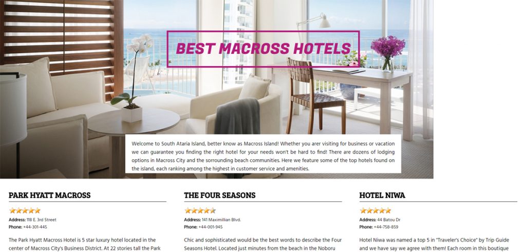
Obviously I didn’t plan properly for the display. My focus had always been on how the website was to display as it resized down on smaller screens, I never thought about how it would look if it had to appear on larger screens. A novice mistake.
The main mistake I made was that I didn’t set a Max-Width for the “Div Container” holding all the content – this was necessary since my top hotel image width was only 1300px. So as the above image demonstrates, on screens with a greater width there is going to be some layout issues.
To resolve this I added to the Div Container a ‘Max-Width: 1300px;’ which fixed. Then I noticed that although it was fixed, the container was aligned to the left. So then I added ‘Margin: auto;’ to the container and that centered it.
I could do so much better with the code for that page now, so I hope to revisit it soon with even more updates.