
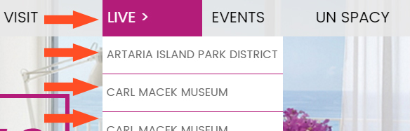
I wanted to build a horizontal menu with a drop down content area on my ‘Macross Hotels’ page. The horizontal menu was to have 3 main options: amenities, images and dining. Then the corresponding drop down section was to contain information pertaining to each category. The tricky part to this was that the menu was to be placed within the page’s content and inside a column with a dynamic width. The column’s width could be 100%, 50% or 33% of the total width of the browser window – or in static terms any length between 310px and 650px. Also, when the drop down appears it is to push the rest of the page’s content down, not overlap it like a traditional drop down menu in a navigation bar would.
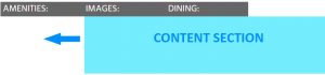
The major issue with this was how I wanted to align the drop down content area. This is best explained in the context of an example. Suppose the content column is 300px wide so therefore your horizontal menu options (‘Amenities’, ‘Images’ and ‘Dining’ buttons) are each 100px in width (each buttons is 1/3 the width of the column). Now suppose I pick the 2nd option (Images), I want the drop down content area to still take up the entire space under the horizontal menu, all 300px. The same for the 3rd option 2 (Dining), that too should take up the entire 300px in space. I had never built a menu like this before, for all the other drop down menus I built the drop down portion aligns directly under the menu option. See the picture below for a better understanding.
How in the world could I get the drop down content section to have variable width and variable positioning? This was a tough nut to crack and a test for newbie skills.
First, let’s remember the skeleton structure for a navigation menu with a drop down: 1) build a button, something to display the text for ‘Amenities’, ‘Images’ and ‘Dining,’ 2) build the content area, a section that will hold all the unique content regarding amenities, images and dining (that will default to being hidden) and 3) a container to hold it all together.
Part 1: The Buttons
Remember, it’s critical the buttons have to have a dynamic width, here is the stripped down CSS:
CSS:
.button-1, button-2, button-3 {background-color: #666; color: #fff; width: 33.3%;}
Note: This was the first time I combined code like this, this is much cleaner and more professional looking.
Part 2: The Content Area
This was the trickiest part! At first it was not clear to me at all on how to do this. I spent a day coding it just with static values…but I knew there had to be a way to make it dynamic. The problem was solved via percentages, and it was such a simple solution!
CSS:
.button-1-content {display: none; width: 300%;}
.button-2-content {display: none; width: 300%; position: relative; left: -100%;}
.button-3-content { display: none; width: 300%; position: relative; left: -200%;}
Its sooooo simple, but it took me a couple of days and hours and hours of trial and error to get to this point! The key was to use percentages for width and positioning. Of course I knew I could use percentage values for width, but I wasn’t sure I could use percentages for left positioning – it was a pleasant surprise that the answer was yes!
Let me explain what is happening in case you’re a little lost, I’ll start with ‘.button-2’ (Dining). Suppose the width of the main column is 450px wide, so that means ‘.button-2’ is 150px wide (set at 33% of the width of the column). The CSS above defines the content section as 300%, or 300% of the width of ‘.button-2.’ Since ‘.button-2’s’ width is 150px, the width of the content section is 450px (300% x 150px). 450px is total width of the column (or navigation bar), which was the the goal!
If you still are having a hard time understanding replace the percent with numbers. Again, let the column be a static 450px in width. The button would be 1/3 the width, or a static 150px. Now we you want the content section under the button to be a full 450px in width so that it would equal the width of the column. That is can be written as 3 x 150px = 450px, which is the same as 300% x 150px.
Next I need to position the 450px wide content section. Currently its left edge is right under the right edge of ‘.button-2.’ So that the 450px wide content section spans the entire horizontal menu I need it to be under the left edge of button-1, like so:
I used ‘position: relative’ and ‘left: -100%’ to achieve this. Remember in the example the width of ‘.button-2’ is 150px. 100% of 150px equals 150px, but I assigned negative 100% to ‘left:‘, therefore the position of the content section will be moved 150px to the left.
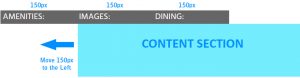
I repeated all of this for ‘.button-3’ – I had to move that button’s associated content area all the way to the left so that it aligned up under ‘button-1’. To do I had to move that content area two places over (pass .button-2 to the edge of .button-1) so you assign ‘left: -200%’ (150px x -200% = 300px). Just to note, you don’t have to do anything complicated for ‘.button-1’ since it will naturally align to the left edge since it is the first button.
I have reiterate that this was not easy for me resolve. After hours of trial and error I had actually came to the conclusion that I couldn’t code this feature in CSS and that maybe I needed JavaScript or some other language to handle the variable width and positioning. I completed the entire feature with static values, but of course the display was lacking since it didn’t adapt to the screen size like the rest of the content did. That nagged at me so I decided to give it another try and I’m glad I did. I didn’t have to resort to any search on CSS Tricks or Stack Overflow to resolve this either which is another accomplishment.
You can view the Macross Hotels page here.